2.2 Modeling Approaches
2.2.10 Example: Challenger Space Shuttle Disaster
library(tidyverse)
library(cmdstanr)
library(posterior)
library(bayesplot)
library(tidybayes)
library(latex2exp)
library(modelr)

url <- "https://raw.githubusercontent.com/CamDavidsonPilon/Probabilistic-Programming-and-Bayesian-Methods-for-Hackers/master/Chapter2_MorePyMC/data/challenger_data.csv"

data <- read_csv(url, col_types = "cdi") %>%
  janitor::clean_names() %>%
  mutate(
    date = if_else(
      nchar(date) >= 10,
      parse_date(date, format = "%m/%d/%Y"),
      parse_date(date, format = "%m/%d/%y")
      )
    ) %>%
  drop_na()
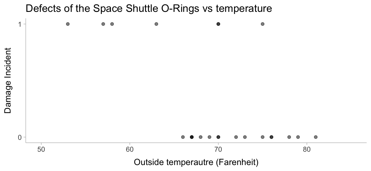
Let’s visualize this data to make sure all is well:
theme_set(theme_tidybayes())

data %>%
  ggplot(aes(x=temperature, y=damage_incident)) +
  geom_point(alpha = 0.5) +
  labs(
    title = "Defects of the Space Shuttle O-Rings vs temperature",
    x = "Outside temperautre (Farenheit)",
    y = "Damage Incident"
  ) +
  scale_y_continuous(breaks = scales::pretty_breaks(n = 1)) +
  xlim(50, 85)
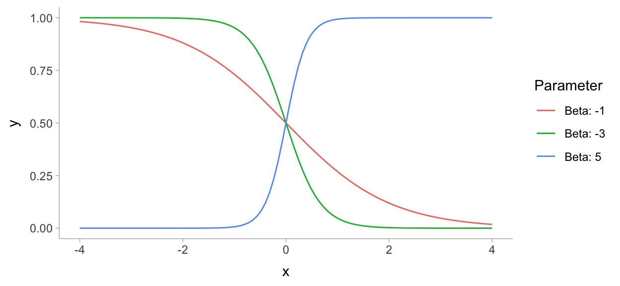
https://jrnold.github.io/bayesian_notes/binomial-models.html
map_df(
  list(-1, -3, 5),
  ~ tibble(
    x = seq(-4, 4, length.out = 101),
    y = plogis(x * .x),
    Parameter = paste0("Beta: ", .x)
    )
  ) %>%
  ggplot(aes(x = x, y = y, colour = Parameter)) +
  geom_line()
2.2.11 The Normal Distribution
data_list <- data %>%
  rename(damage = damage_incident) %>%
  compose_data()
mod <- cmdstanr::cmdstan_model("models/ch2-mod.stan")
mod$print()
data {
  int<lower=0> n;
  vector[n] temperature;
  int<lower=0,upper=1> damage[n];
}

parameters {
  real alpha;
  real beta;
}

model {
  alpha ~ normal(0, sqrt(1000));
  beta ~ normal(0, sqrt(1000));
  damage ~ bernoulli_logit(beta * temperature + alpha);
}

generated quantities {
  vector[n] yrep;
  for (i in 1:n){
    yrep[i] = bernoulli_logit_rng(beta * temperature[i] + alpha);
  }
}
fit <- mod$sample(
data = data_list,
seed = 123,
chains = 4,
parallel_chains = 4,
refresh = 1000,
iter_sampling = 3000
)
Running MCMC with 4 parallel chains...

Chain 1 Iteration:    1 / 4000 [  0%]  (Warmup)
Chain 2 Iteration:    1 / 4000 [  0%]  (Warmup)
Chain 3 Iteration:    1 / 4000 [  0%]  (Warmup)
Chain 4 Iteration:    1 / 4000 [  0%]  (Warmup)
Chain 1 Iteration: 1000 / 4000 [ 25%]  (Warmup)
Chain 1 Iteration: 1001 / 4000 [ 25%]  (Sampling)
Chain 2 Iteration: 1000 / 4000 [ 25%]  (Warmup)
Chain 2 Iteration: 1001 / 4000 [ 25%]  (Sampling)
Chain 3 Iteration: 1000 / 4000 [ 25%]  (Warmup)
Chain 3 Iteration: 1001 / 4000 [ 25%]  (Sampling)
Chain 4 Iteration: 1000 / 4000 [ 25%]  (Warmup)
Chain 4 Iteration: 1001 / 4000 [ 25%]  (Sampling)
Chain 1 Iteration: 2000 / 4000 [ 50%]  (Sampling)
Chain 2 Iteration: 2000 / 4000 [ 50%]  (Sampling)
Chain 3 Iteration: 2000 / 4000 [ 50%]  (Sampling)
Chain 4 Iteration: 2000 / 4000 [ 50%]  (Sampling)
Chain 1 Iteration: 3000 / 4000 [ 75%]  (Sampling)
Chain 4 Iteration: 3000 / 4000 [ 75%]  (Sampling)
Chain 2 Iteration: 3000 / 4000 [ 75%]  (Sampling)
Chain 3 Iteration: 3000 / 4000 [ 75%]  (Sampling)
Chain 1 Iteration: 4000 / 4000 [100%]  (Sampling)
Chain 2 Iteration: 4000 / 4000 [100%]  (Sampling)
Chain 3 Iteration: 4000 / 4000 [100%]  (Sampling)
Chain 4 Iteration: 4000 / 4000 [100%]  (Sampling)
Chain 1 finished in 0.8 seconds.
Chain 2 finished in 0.9 seconds.
Chain 3 finished in 0.9 seconds.
Chain 4 finished in 0.9 seconds.

All 4 chains finished successfully.
Mean chain execution time: 0.9 seconds.
Total execution time: 1.1 seconds.fit$summary()
# A tibble: 26 x 10
   variable    mean  median    sd   mad      q5     q95  rhat ess_bulk
   <chr>      <dbl>   <dbl> <dbl> <dbl>   <dbl>   <dbl> <dbl>    <dbl>
 1 lp__     -11.3   -11.0   1.02  0.743 -13.3   -10.3    1.00    2616.
 2 alpha     17.4    16.6   7.77  7.66    6.16   31.2    1.00    1526.
 3 beta      -0.267  -0.256 0.114 0.112  -0.469  -0.104  1.00    1536.
 4 yrep[1]    0.448   0     0.497 0       0       1      1.00   11428.
 5 yrep[2]    0.232   0     0.422 0       0       1      1.00   11617.
 6 yrep[3]    0.270   0     0.444 0       0       1      1.00   11845.
 7 yrep[4]    0.327   0     0.469 0       0       1      1.00   11921.
 8 yrep[5]    0.376   0     0.484 0       0       1      1.00   11480.
 9 yrep[6]    0.156   0     0.363 0       0       1      1.00   11547.
10 yrep[7]    0.128   0     0.334 0       0       1      1.00   10240.
# … with 16 more rows, and 1 more variable: ess_tail <dbl>
https://mpopov.com/blog/2020/09/07/pivoting-posteriors/
tidy_draws.CmdStanMCMC <- function(model, ...) {
  return(as_draws_df(model$draws()))
}
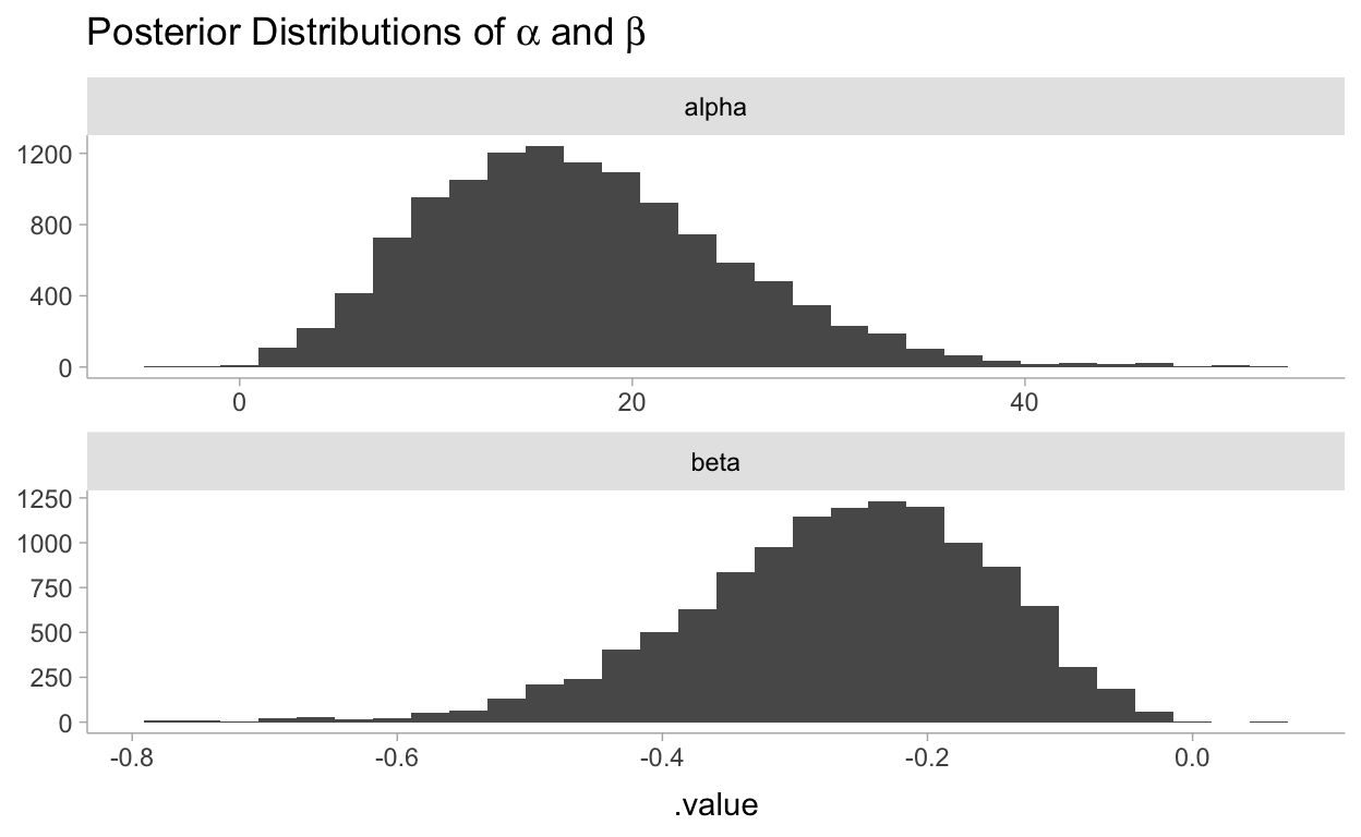
fit %>%
  gather_draws(alpha, beta) %>%
  ggplot(aes(x = .value)) +
  geom_histogram() +
  facet_wrap(~.variable, scales = "free", ncol = 1) +
  labs(
    title = TeX("Posterior Distributions of $\\alpha$ and $\\beta$"),
    y = NULL
  )
Using comments from discourse:
Extract posterior parameter samples into R and do prediction in R with new-data-for-prediction.
post_df <- spread_draws(fit, alpha, beta)
t <- seq(min(data$temperature) - 5, max(data$temperature) + 5, length.out = 50)

pred_df <- tibble(temperature = t) %>%
  mutate(nest(post_df)) %>% # nest all posterior parameters samples
  mutate(
    data = map2(
      data,
      temperature,
      ~ mutate(.x, pred = plogis(alpha + beta * .y)) # predict
    )
  ) %>%
  unnest(data)
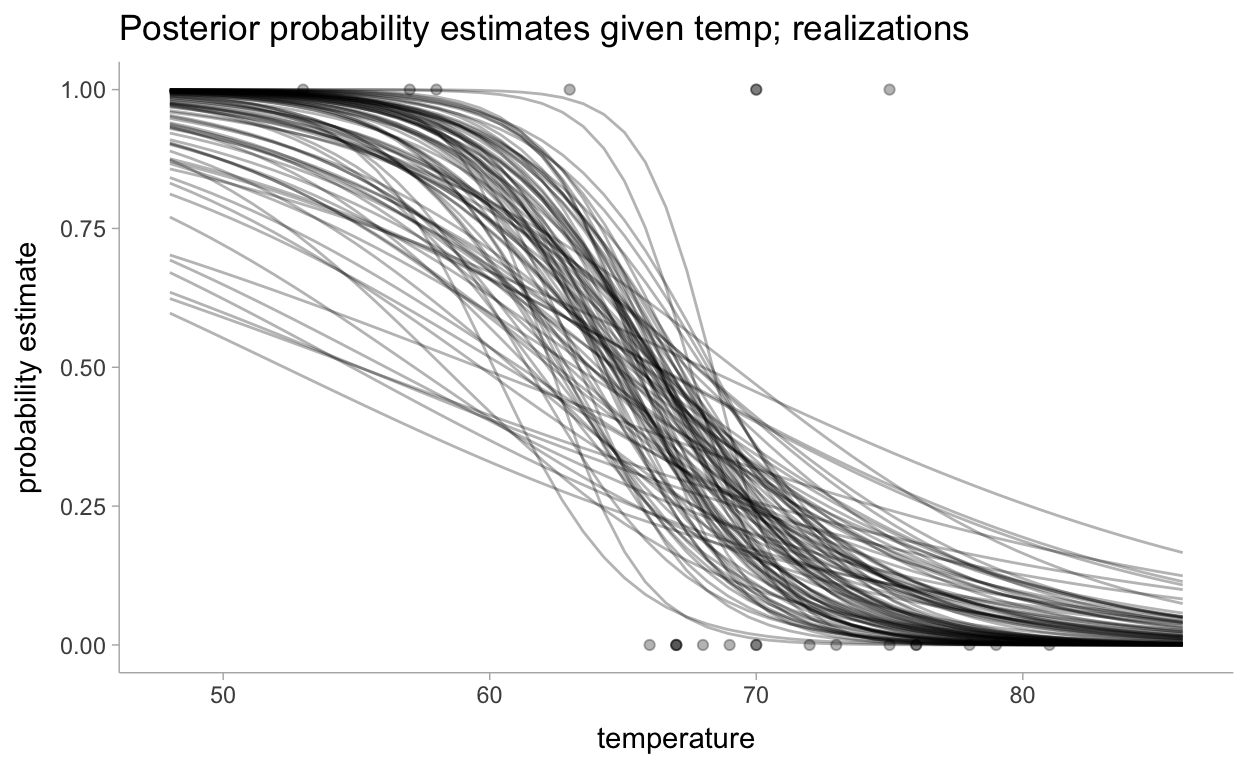
Now for the visualizations. First let’s look at realizations and then will summarize all of the realizations:
pred_df %>%
  group_by(temperature) %>%
  sample_draws(100) %>%
  ggplot(aes(x = temperature)) +
  geom_line(aes(y = pred, group = .draw), alpha = 0.3) +
  geom_point(data = data, aes(y = damage_incident), alpha = 0.3) +
  labs(
    title = "Posterior probability estimates given temp; realizations",
    y = "probability estimate"
  )
Now for all of the realizations:
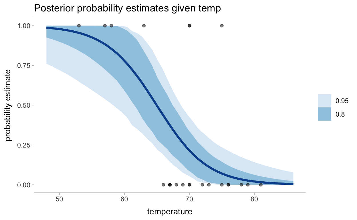
pred_df %>%
  group_by(temperature) %>%
  median_hdci(pred, .width = c(0.95, 0.8)) %>%
  ggplot(aes(x = temperature)) +
  geom_lineribbon(aes(y = pred, ymin = .lower, ymax = .upper), color = "#08519C") +
  geom_point(data = data, aes(y = damage_incident), alpha = 0.5) +
  scale_fill_brewer() +
  labs(
    title = "Posterior probability estimates given temp",
    y = "probability estimate"
  )
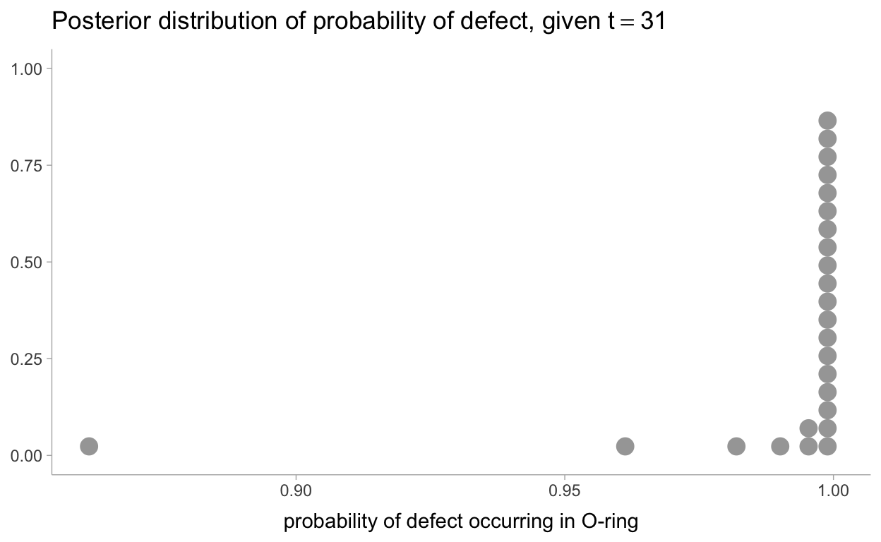
2.2.12 What about the day of the Challenger disaster?
On the day of the Challenger disaster, the outside temperature was
31degrees Fahrenheit. What is the posterior distribution of a defect occurring, given this temperature? The distribution is plotted below. It looks almost guaranteed that the Challenger was going to be subject to defective O-rings.
prob_31 <- post_df %>%
  mutate(pred = plogis(alpha + beta * 31))

prob_31 %>%
  ggplot(aes(x = pred)) +
  stat_dots(quantiles = 25) +
  labs(
    title = TeX("Posterior distribution of probability of defect, given $t = 31$"),
    x = "probability of defect occurring in O-ring",
    y = NULL
  )
2.3 Is Our Model Appropriate?
2.3.1 Separation Plots
Where expected number of defects for the Bernoulli random variable is given as:
\[ E[S] = \sum_{i=0}^N E[X_i] = \sum_{i=0}^N p_i \] Preparing our data for the separation plot:
sep_data <- fit %>%
  spread_draws(yrep[day]) %>%
  mean_hdci(yrep) %>%
  left_join(mutate(data, day = row_number())) %>%
  arrange(yrep) %>%
  mutate(idx = row_number())

exp_def <- sep_data %>%
  summarize(exp_def = sum(yrep)) %>%
  pull()
Now let’s review the separation plot:
sep_data %>%
  ggplot(aes(x=idx)) +
  geom_col(aes(y=damage_incident), alpha = 0.3) +
  geom_step(aes(y = yrep)) +
  geom_vline(xintercept = 23 - exp_def, linetype = "dotted") +
  labs(
    title = "Separation Plot",
    subtitle = paste0("with ", round(exp_def, 1), " expected defects"),
    y = NULL,
    x = NULL
  )
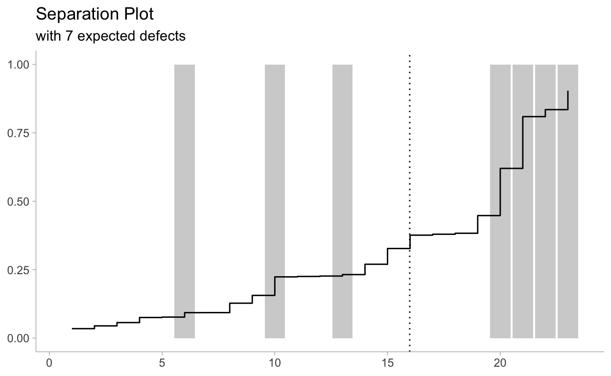
The snaking-line is the sorted probabilities,
bluegray bars denote defects, and empty space denote non-defects. As the probability rises, we see more and more defects occur. On the right hand side, the plot suggests that as the posterior probability is large (line close to 1), then more defects are realized. This is good behaviour. Ideally, all thebluegray bars should be close to the right-hand side, and deviations from this reflect missed predictions.