1.4 Using Computers to Perform Bayesian Inference for Us
1.4.1 Example: Inferring Behavior from Text-Message Data
library(tidyverse)
library(cmdstanr)
library(posterior)
library(bayesplot)
library(tidybayes)
library(latex2exp)

url <- "https://raw.githubusercontent.com/CamDavidsonPilon/Probabilistic-Programming-and-Bayesian-Methods-for-Hackers/master/Chapter1_Introduction/data/txtdata.csv"

data <- read_csv(url, col_names = FALSE) %>%
  rename(count = X1) %>%
  mutate(day = row_number())
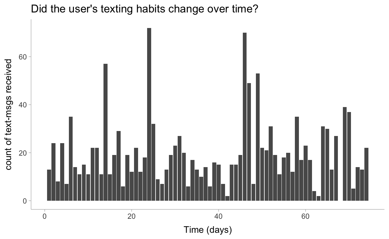
Let’s visualize this data to make sure all is well:
theme_set(theme_tidybayes())

data %>%
  ggplot(aes(x=day, y=count)) +
  geom_col() +
  labs(
    title = "Did the user's texting habits change over time?",
    x = "Time (days)",
    y = "count of text-msgs received"
  )
1.4.2 Introducing Our First Hammer: PyMC Stan
This is where things get interesting. The original model included a discrete random variable \(\tau\) that was modeled with a Discrete Uniform distribution. Then they sampled with the Metropolis algorithm so it was possible to sample from a joint distribution including this discrete parameter.
A limitation (I suppose) of the main algorithm used by Stan, HMC, is that everything must be differentiable and so discrete parameters are off the table. However, with a little statistical theory you’re still able to estimate this model and even the posterior of \(\tau\) by marginalizing the parameter out of the probability function. Then recovering this parameter afterwards in the generated quantities block!
See the Stan manual as well as this blog post for more info on implementing this model and the marginalization process.
data_list <- tidybayes::compose_data(data)
data_list[['alpha']] <- 1 / mean(data_list$count)
data_list
$count
 [1] 13 24  8 24  7 35 14 11 15 11 22 22 11 57 11 19 29  6 19 12 22 12
[23] 18 72 32  9  7 13 19 23 27 20  6 17 13 10 14  6 16 15  7  2 15 15
[45] 19 70 49  7 53 22 21 31 19 11 18 20 12 35 17 23 17  4  2 31 30 13
[67] 27  0 39 37  5 14 13 22

$day
 [1]  1  2  3  4  5  6  7  8  9 10 11 12 13 14 15 16 17 18 19 20 21 22
[23] 23 24 25 26 27 28 29 30 31 32 33 34 35 36 37 38 39 40 41 42 43 44
[45] 45 46 47 48 49 50 51 52 53 54 55 56 57 58 59 60 61 62 63 64 65 66
[67] 67 68 69 70 71 72 73 74

$n
[1] 74

$alpha
[1] 0.05065024
Here’s the Stan code used for estimating this joint probability distribution:
data {
  int<lower=1> n;
  int<lower=0> count[n];
  real alpha;
}

transformed data {
  real log_unif;
  log_unif = -log(n);
}

parameters {
  real<lower=0> lambda_1;
  real<lower=0> lambda_2;
}

transformed parameters {
  vector[n] lp;
  lp = rep_vector(log_unif, n);
  for (tau in 1:n)
    for (i in 1:n)
      lp[tau] += poisson_lpmf(count[i] | i < tau ? lambda_1 : lambda_2);
}

model {
  lambda_1 ~ exponential(alpha);
  lambda_2 ~ exponential(alpha);
  target += log_sum_exp(lp);
}

generated quantities {
  int<lower=1,upper=n> tau;
  vector<lower=0>[n] expected;
  // posterior of discrete change point
  tau = categorical_logit_rng(lp);
  // predictions for each day
  for (day in 1:n)
    expected[day] = day < tau ? lambda_1 : lambda_2;
}
Now for sampling from the distribution and obtaining the marginal distributions:
mod <- cmdstanr::cmdstan_model("models/ch1-mod.stan")

fit <- mod$sample(
  data = data_list,
  seed = 123,
  chains = 4,
  parallel_chains = 4,
  refresh = 1000,
  iter_sampling = 3000
)
Running MCMC with 4 parallel chains...

Chain 1 Iteration:    1 / 4000 [  0%]  (Warmup)
Chain 2 Iteration:    1 / 4000 [  0%]  (Warmup)
Chain 3 Iteration:    1 / 4000 [  0%]  (Warmup)
Chain 4 Iteration:    1 / 4000 [  0%]  (Warmup)
Chain 1 Iteration: 1000 / 4000 [ 25%]  (Warmup)
Chain 1 Iteration: 1001 / 4000 [ 25%]  (Sampling)
Chain 4 Iteration: 1000 / 4000 [ 25%]  (Warmup)
Chain 4 Iteration: 1001 / 4000 [ 25%]  (Sampling)
Chain 2 Iteration: 1000 / 4000 [ 25%]  (Warmup)
Chain 2 Iteration: 1001 / 4000 [ 25%]  (Sampling)
Chain 3 Iteration: 1000 / 4000 [ 25%]  (Warmup)
Chain 3 Iteration: 1001 / 4000 [ 25%]  (Sampling)
Chain 1 Iteration: 2000 / 4000 [ 50%]  (Sampling)
Chain 4 Iteration: 2000 / 4000 [ 50%]  (Sampling)
Chain 2 Iteration: 2000 / 4000 [ 50%]  (Sampling)
Chain 3 Iteration: 2000 / 4000 [ 50%]  (Sampling)
Chain 1 Iteration: 3000 / 4000 [ 75%]  (Sampling)
Chain 2 Iteration: 3000 / 4000 [ 75%]  (Sampling)
Chain 4 Iteration: 3000 / 4000 [ 75%]  (Sampling)
Chain 3 Iteration: 3000 / 4000 [ 75%]  (Sampling)
Chain 1 Iteration: 4000 / 4000 [100%]  (Sampling)
Chain 1 finished in 11.5 seconds.
Chain 2 Iteration: 4000 / 4000 [100%]  (Sampling)
Chain 2 finished in 12.9 seconds.
Chain 4 Iteration: 4000 / 4000 [100%]  (Sampling)
Chain 4 finished in 13.1 seconds.
Chain 3 Iteration: 4000 / 4000 [100%]  (Sampling)
Chain 3 finished in 13.9 seconds.

All 4 chains finished successfully.
Mean chain execution time: 12.9 seconds.
Total execution time: 14.4 seconds.fit$summary()
# A tibble: 152 x 10
   variable   mean median    sd   mad     q5    q95  rhat ess_bulk
   <chr>     <dbl>  <dbl> <dbl> <dbl>  <dbl>  <dbl> <dbl>    <dbl>
 1 lp__     -481.  -481.  1.13  0.715 -483.  -480.   1.00    4770.
 2 lambda_1   17.8   17.7 0.678 0.646   16.7   18.8  1.00    6623.
 3 lambda_2   22.7   22.7 0.981 0.889   21.2   24.2  1.00    8000.
 4 lp[1]    -512.  -511.  9.47  8.46  -529.  -500.   1.00    9227.
 5 lp[2]    -511.  -509.  9.16  8.10  -526.  -499.   1.00    9025.
 6 lp[3]    -512.  -510.  9.13  8.14  -527.  -500.   1.00    9516.
 7 lp[4]    -509.  -507.  8.71  7.58  -524.  -498.   1.00    9131.
 8 lp[5]    -510.  -508.  8.67  7.61  -524.  -499.   1.00    9471.
 9 lp[6]    -506.  -505.  8.25  7.01  -520.  -496.   1.00    9095.
10 lp[7]    -510.  -509.  8.48  7.46  -525.  -499.   1.00    9637.
# … with 142 more rows, and 1 more variable: ess_tail <dbl>
# https://mpopov.com/blog/2020/09/07/pivoting-posteriors/
tidy_draws.CmdStanMCMC <- function(model, ...) {
return(as_draws_df(model$draws()))
}
Let’s visualize the marginal distributions of \(\lambda_1\) and \(\lambda_2\):
draws_df <- as_draws_df(fit$draws(c("lambda_1", "lambda_2", "tau")))

draws_df %>%
  gather_draws(lambda_1, lambda_2) %>%
  ggplot(aes(y = .variable, x = .value)) +
  stat_dotsinterval(quantiles = 100) +
  labs(
    title = TeX("Posterior Distributions of $\\lambda_1$ and $\\lambda_2$"),
    y = NULL
  )
Reviewing when the change point occurred:
draws_df %>%
  gather_draws(tau) %>%
  ggplot(aes(x = .value)) +
  geom_bar(aes(y = ..count../sum(..count..))) +
  scale_x_continuous(breaks = scales::pretty_breaks(10), limits = c(40, 50)) +
  labs(
    title = TeX("Posterior Distribution of $\\tau$"),
    y = "probability",
    x = TeX("$\\tau$ (in days)")
  )
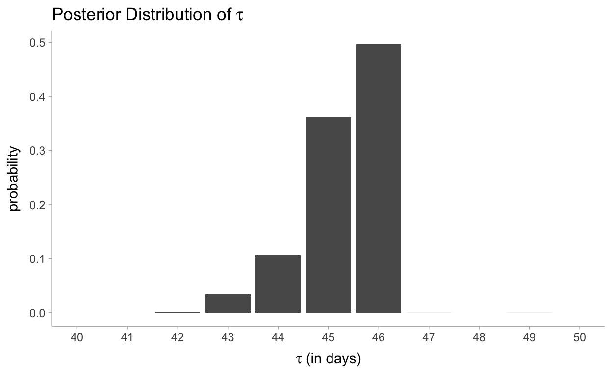
Our analysis also returned a distribution for \(\tau\). Its posterior distribution looks a little different from the other two because it is a discrete random variable, so it doesn’t assign probabilities to intervals. We can see that near day 46, there was a 50% chance that the user’s behaviour changed. Had no change occurred, or had the change been gradual over time, the posterior distribution of \(\tau\) would have been more spread out, reflecting that many days were plausible candidates for \(\tau\). By contrast, in the actual results we see that only three or four days make any sense as potential transition points.
1.4.4 What Good Are Samples from the Posterior, Anyways?
Now for calculating the expected values:
predictions <- fit$draws("expected") %>%
  as_draws_df() %>%
  spread_draws(expected[day])

predictions
# A tibble: 888,000 x 5
# Groups: day [74]
day expected .chain .iteration .draw
<int> <dbl> <int> <int> <int>
1 1 18.8 1 1 1
2 1 16.8 1 2 2
3 1 17.9 1 3 3
4 1 18.3 1 4 4
5 1 17.3 1 5 5
6 1 17.8 1 6 6
7 1 17.8 1 7 7
8 1 17.7 1 8 8
9 1 16.4 1 9 9
10 1 17.9 1 10 10
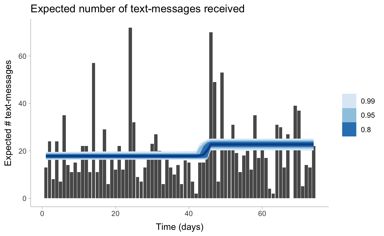
# … with 887,990 more rowsLet’s visualize these predictions now including the uncertainty around our \(\lambda\) parameters:
predictions %>%
  mean_qi(.width = c(.99, .95, .8)) %>%
  ggplot(aes(x = day)) +
  geom_col(data = data, aes(y = count)) +
  geom_lineribbon(aes(y = expected, ymin = .lower, ymax = .upper), color = "#08519C") +
  labs(
    title = "Expected number of text-messages received",
    x = "Time (days)",
    y = "Expected # text-messages"
  ) +
  scale_fill_brewer()
1.6 Appendix
1.6.1 Determining Statistically if the Two \(\lambda\)s Are Indeed Different?
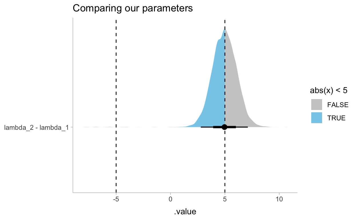
Now for reviewing the difference between these two \(\lambda\)’s. In the book he answers this question with explicit probabilities but we can also represent the same question with a data visualization. This shows us that the probability that these \(\lambda\)s differ by at least 5 times is 50%.
draws_df %>%
  gather_draws(lambda_1, lambda_2) %>%
  compare_levels(.value, by = .variable) %>%
  ggplot(aes(y = .variable, x = .value, fill = stat(abs(x) < 5))) +
  stat_halfeye() +
  geom_vline(xintercept = c(-5,5), linetype = "dashed") +
  scale_fill_manual(values = c("gray80", "skyblue")) +
  labs(
    title = "Comparing our parameters",
    y = NULL
  )